Moody blues with Resene
Photography Christine Francis.
 BROUGHT TO YOU BY Resene
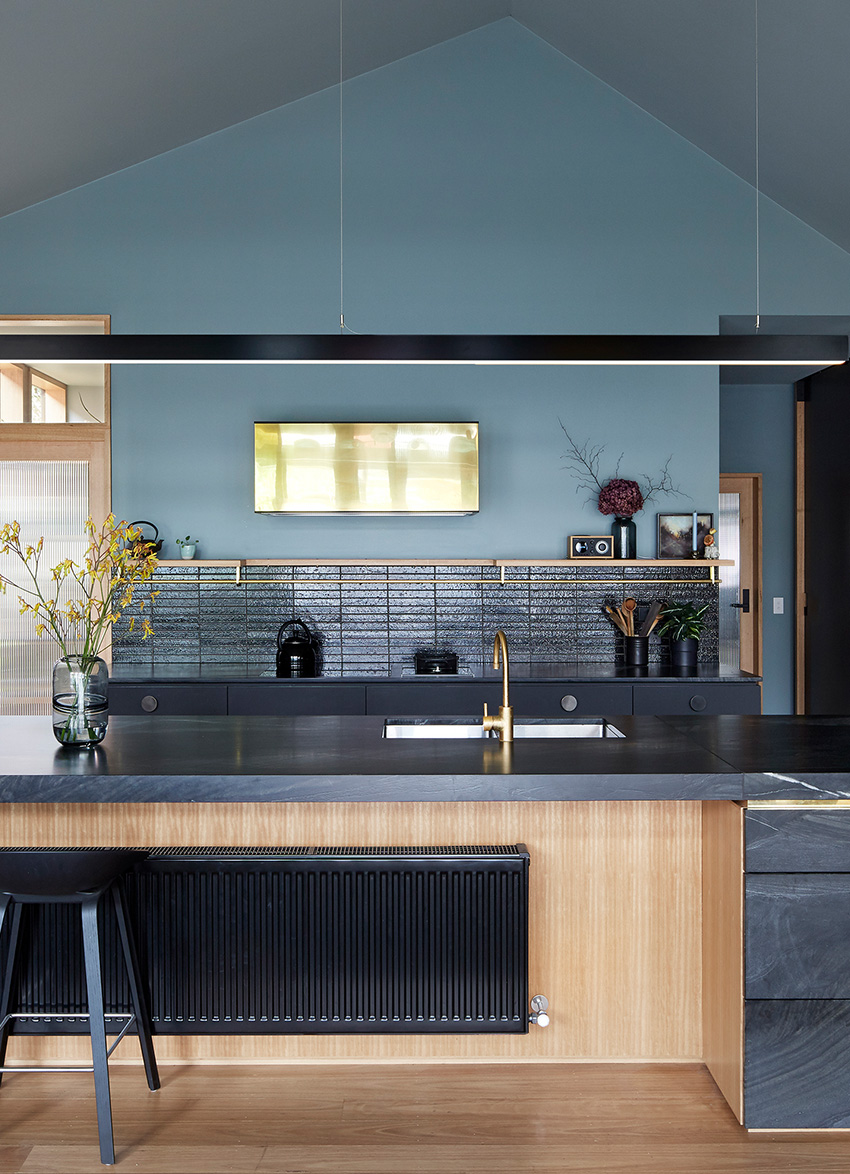
The quality of Melbourne’s winter light was one key inspiration for the owners of this elegant and atmospheric kitchen.
Other inspirations were “hazy, gloomy ethereal artworks and films. Those inspirations in the hands of designers Kirsty Fletcher and Giles Lawson, directors of Melbourne’s The Rexroth Mannasmann Collective, are anything but gloomy.
Kirsty says most finishes in the kitchen were chosen by the property owners for their mutability in relation to light sources and other, adjacent colours.
“The whole house was about creating moody atmospheric spaces and we initially struggled to find a paint colour for the kitchen that had some life to it and wasn’t overwhelmed by other, adjacent dark surfaces.”
The original plan for the high, steeply angled kitchen ceiling was to paint it black, but the angles and expanse of the space meant getting a good finish was tricky. Instead the owners opted for Resene Innocence.
Not only did it work well with extensive use of black in other parts of the living area, both the owners and Kirsty loved the changeable nature of the shade.
“Resene Innocence is a chameleonic colour that changes from grey to green to blue yet sits in harmony with the black fit-out,” Kirsty says.
Giles adds that with black as a feature colour in many other areas of the home, the kitchen colour needed to both blend with black while offering some subtle contrast. One of the charms of Resene Innocence, he says, is that it can look different in different areas of the same room.
“Are the walls and ceiling blue? Grey? Green? How can it be the same paint on all the surfaces?”
The new kitchen was built in place of a lean-to at the rear of an old Edwardian home in Melbourne, and was part of a larger renovation of the property that also included a walk-in pantry, and an adjacent living area.
One of the striking, yet practical, features of the kitchen is the addition of three large sliding doors that can divide the kitchen off from the otherwise open plan living area. The doors are painted in Resene Bastille, Resene Blue Bark and Resene Woodsmoke, colours again chosen for the way they change depending on the light around them.
“Depending on the time of the day, the lighting and the angle of viewing the doors morph from a black backdrop to part of the colour scheme, adding blue, green and purple highlights,” Kirsty says.
The finished kitchen, she says meets the original brief to create a great place for cooking, with plenty of storage so the space looks uncluttered, using robust, no-fuss materials that had longevity. The owners say has also become the social hub of the home.
IN KIRSTY'S WORDS:
What is your favourite part of the finished kitchen?
The blackened-brass handles (that will age and wear over time), the Nerofino quartzite stone and the oodles of storage, but really, we love it all.
Describe your cooking style
Varied but we love to use fresh, seasonal, home-grown or local produce to make veggie-centric meals.
Which recipe from this issue of Dish would you like to cook (or have cooked for you) and why?
It is hard to pass up Coq au Vin Blanc if someone is going to cook it for me.
You could add seasonal veges from the garden like French beans or pumpkin.
Resene Innocence, used over the walls and vaulted ceiling of this Melbourne kitchen, is loved by the owners for how it changes in different light conditions. The three sliding doors are painted in Resene Woodsmoke, Resene Blue Bark and Resene Bastille.
TOP TIP: If you’re painting cabinetry, use Resene Lustacryl semi-gloss or Resene Enamacryl gloss for a hardwearing, durable finish.
For more decorating inspiration, visit your Resene ColorShop, resene.com/colorshops
latest issue:
127
In Dream Escape, we journey from Japan and Morocco to Italy, India and beyond, sharing recipes inspired by travel, heritage and comfort. We celebrate the champions of the Outstanding Food Producer Awards, explore the stories and recipes of chefs shaped by their cultural roots, and warm up with everything from West African soups and slow-braised lamb to porchetta, butter chicken and beef noodle soup. Alongside destination menus, Scandinavian sweets and cosy pub classics, Chrisanne Terblanche shares her favourite street-side dining spots in Bangkok, while Yvonne Lorkin explores red wine varietals. This issue, we invite you to slow down, turn the pages and escape through food.